©25
Branding
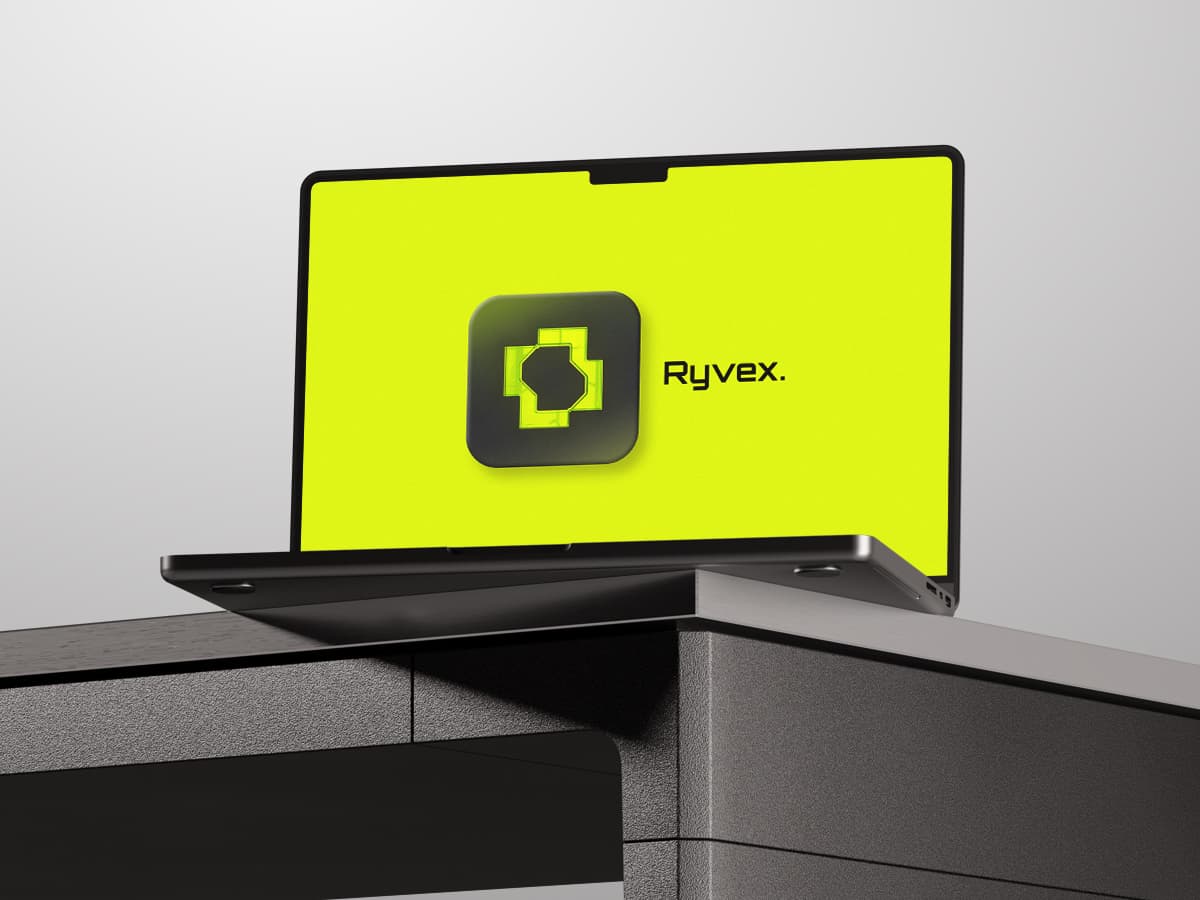
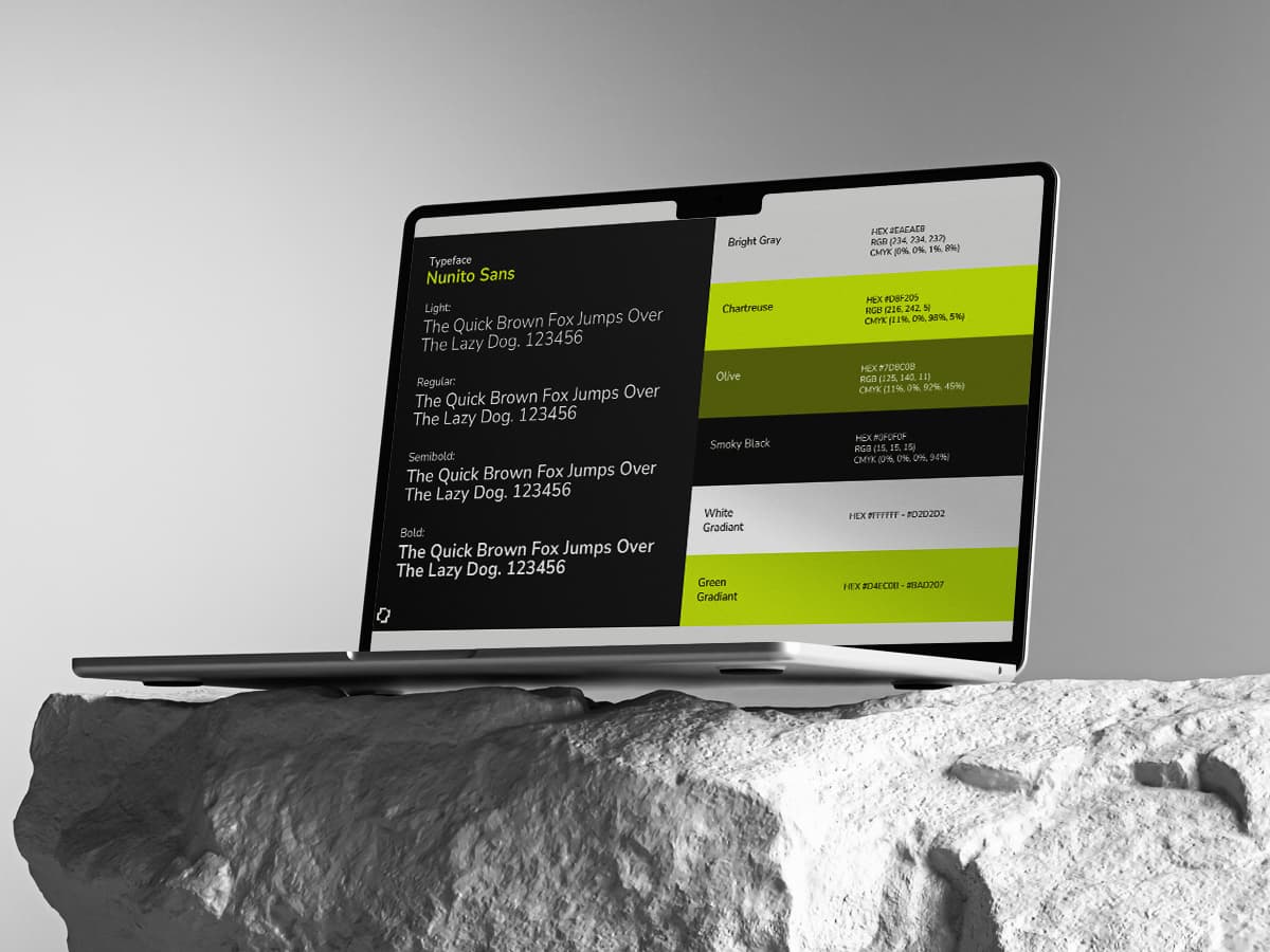
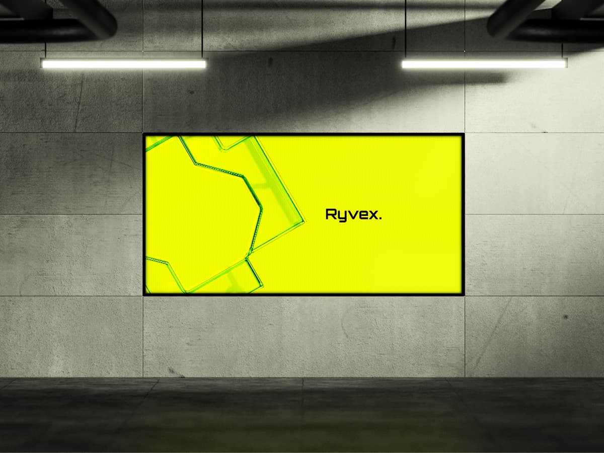
Ryvex is a sports company. The work was the brand itself: mark, wordmark, type system and colour, applied across kit and apparel, and the rules that keep it intact whether it lands on a jersey sleeve, a bottle, a stadium screen or a phone.

( Concept )
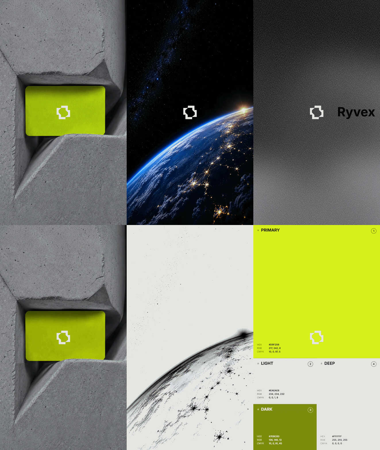
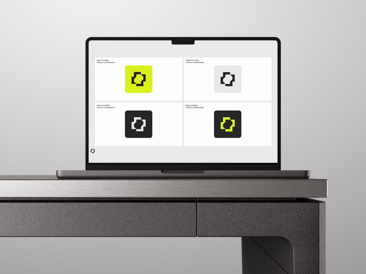
Sport branding has one failure mode. It shouts. Every mark is angled, every gradient is a speed line, and the whole category ends up looking like one brand with different letters in it. Ryvex was drawn the other way. The mark comes from a single geometric move that reads at speed and holds still when nothing is moving. Type carries the weight, set tight and confident, so the identity survives being printed small on a sleeve or stretched across a pitch-side board. Colour is deliberately narrow. One committed tone against a neutral base, so a Ryvex product is recognisable from the far side of a court before the logo is legible. Confidence is quieter than noise, and it lasts a great deal longer.