©25
Branding
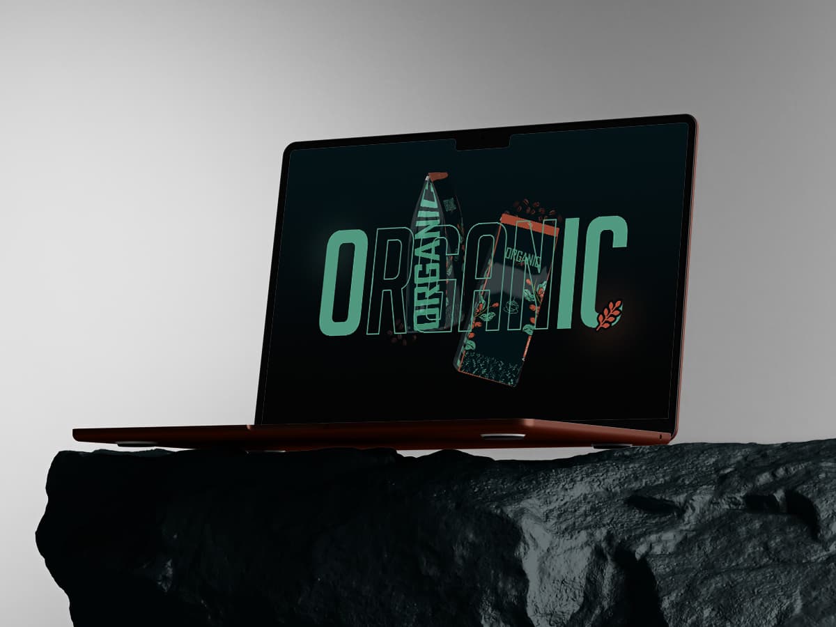
Organic is a juice and beverage company. The brief was a full identity, and the theme the client arrived with was already the strongest thing on the table, so we did not replace it. We built outward from it instead: mark, type, colour, bottle and label system, and every surface a beverage has to live on, from chiller shelf to phone screen.
( Concept )
Every juice brand on the shelf says the same word. Organic. Natural. Cold pressed. The word is worthless because everyone owns it. What is scarce is proof. So the identity leans on evidence instead of adjectives. The palette is taken from the fruit itself rather than a designer's idea of freshness. Labels give the ingredient list the space usually reserved for a slogan. The mark is drawn to survive condensation, a crowded chiller and a thumbnail, because that is where it is actually seen. It reads honest at arm's length and rewards a closer look. In a chiller cabinet, that is the only order that matters.